If you’ve ever tried to analyze your data by Country, Apple Search Ads Campaign, or any other segment that might have an overwhelming number of dimensions: we’ve got good news for you.
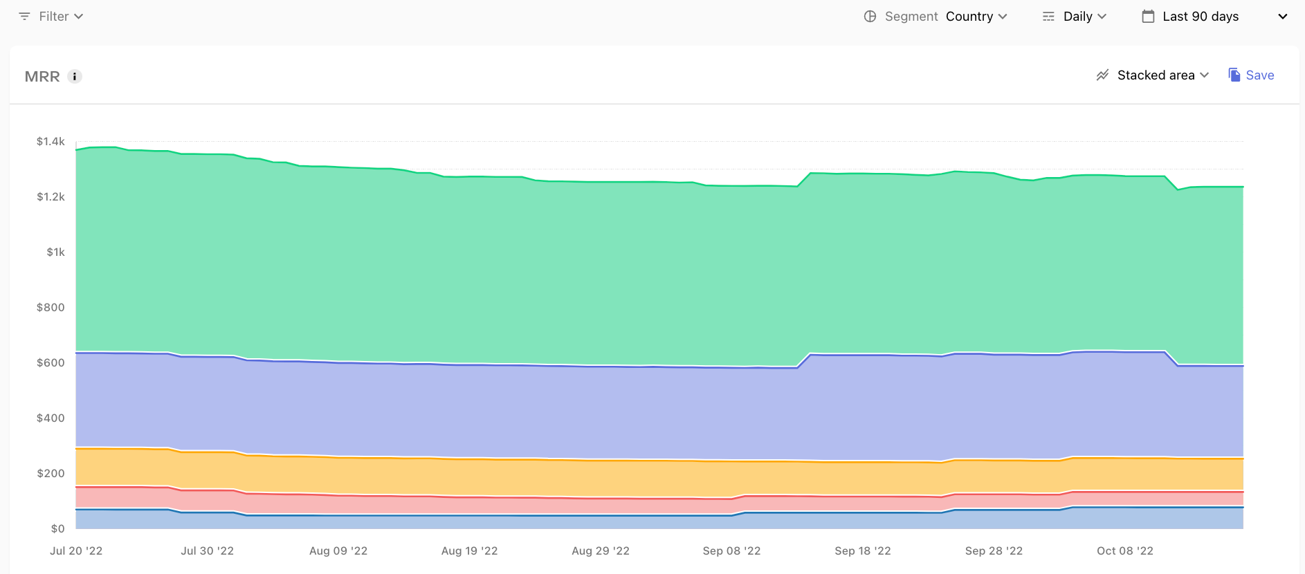
Charts links now specify when a custom segment visualization has been applied, which means you can select just the segments you want to view in your data table, and then save a chart like this one -- MRR in Top 5 Countries -- to get a clear, focused view on your data.
Check it out and let us know what custom views your saving!


