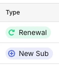
I wanted to start a quick conversation about the recent UI update to the subscription type badges—specifically the Renewal and New Sub tags.
As developers, we stare at this dashboard daily. I noticed the recent changes to these tags, and to be honest, I think the older version was much better. With these new heavy pill-shaped backgrounds, they look exactly like clickable buttons rather than simple status indicators. This can be visually confusing and draws unnecessary attention away from the actual data.
A cleaner, more minimalist approach—like what we had before, or just simple colored text without the solid backgrounds—makes the interface feel much more intuitive and native to our daily workflow.
I've attached a screenshot showing exactly the ones I mean.
Does anyone else feel the same way about this recent change? Would love to hear your thoughts!
Thanks for taking the time to write this up. Feedback like this is genuinely useful, especially from people who live in the dashboard every day.
We’re actively discussing this with the design team right now, so we’re very interested in hearing everyone’s thoughts! The recent change was meant to address a long-standing consistency and readability issue: these overview labels were one of the last places that didn’t match the status badges used elsewhere in the product, and the older styling made it harder to tell statuses apart at a glance (including for folks who rely less on color alone).
That said, we’re iterating on all the feedback we’ve received. We’d love to hear from others too.