Full roll-out of our new charts

  • 8 November 2021
  • 9 replies
  • 403 views

Userlevel 5
Badge +7
  • RevenueCat Staff
  • 173 replies

Over the past few months, we’ve been busy at work improving our new charts. Starting today, we have migrated everyone to the new charts experience. The new charts do not just have a refreshed look & feel, they also provide improved functionality over the old charts:

  • We have launched a number of new charts:

    • Annual Recurring Revenue (ARR) provides an industry-standard way of looking at your recurring revenue, normalized by subscription duration.

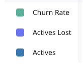
    • Movement charts (Active Subscriptions Movement, MRR Movement, Active Trials Movement) provide full transparency on what causes important indicators of your business to increase or decrease.

    • Refund Rate offers a view of what proportion of your transactions end up getting refunded.

    • Initial Conversion allows analyzing what proportion of newly acquired customers take an action on your paywall (starting a free trial, starting a paid subscription, or making a one-time purchase).

    • Conversion to Paid allows analyzing what proportion of newly acquired customers end up paying.

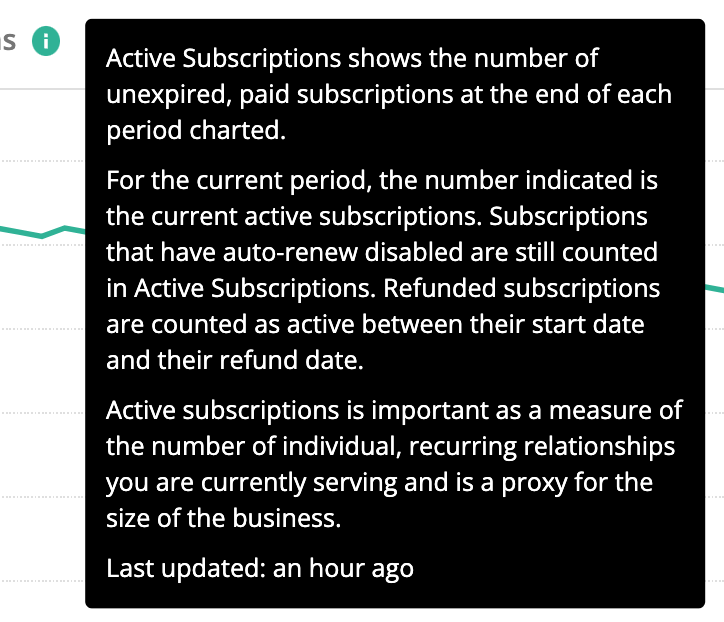
  • Data in the new charts gets refreshed much more frequently. Data in the new charts is typically less than an hour old; the old charts refreshed only on a daily basis. You can find out when the data was last refreshed by hovering over the (i) icon on any chart.


We will keep iterating on these new charts and adding new charts and new ways to slice and dice the data. Not all old charts were migrated 1:1 to the new charts, we tried to consciously improve the data presentation in the new charts. 

If you have questions, requests for additional information to show, or any other comments, please let us know in the comments below!


9 replies

Badge

Hi @Jens 


Thanks for the post, the new charts are gorgeous!


We have a question regarding the new Churn chart.


What filters we can apply to the Customers Lists to directly view the users that make up this Actives Lost data point?


Thank you!

Userlevel 5
Badge +7

Hi @Joel Perkins ,


Thanks! That’s a fantastic question. It’s not 100% possible to get to the exact same definition in customer lists as in charts, particularly since the lists are a snapshot of the current state, whereas the charts show changes over time, but here’s a filter setup that will get you the data for recently churned subscriptions (see image below):

  • Filter by “Status is Expired” – this means you are only including customers who HAD an active subscription but no longer do (This is where the chart differs from the lists, in the charts you would also see people in the past data points who churned and then later re-subscribed. I am assuming you mostly want this data to e.g. reach out via CRM, and therefore it would make most sense to exclude customers who have since re-subscribed)
  • Filter by “Latest Expiration Date > (some date)” – e.g., in the example below, I am filtering by subscribers expired in November. You can of course change this or leave it out altogether; if defined like below, it basically matches the last data point of the chart when shown on a monthly basis
  • Filter by “Total spent > $0” – This is to exclude people who only ever had a trial (they are not counted in the Active Subscriptions Movement chart which only includes people with a paid subscription). Again, if you want a list of all subscribers (trial and paid) whose subscription expired recently, you can simply leave out this filter.


Hope that helps!

Jens


Badge

@Jens


Thanks for the reply.


When using the above filters we are not able to generate a Customer List of users that aligns with the data shown in the Churn chart as Actives Lost for any period of time.


As you are aware, Churn and Conversion are key metrics and the accuracy of this report is of the utmost importance for our leadership teams. 


We are concerned that we cannot examine or verify the Actives Lost data being reported in the Churn chart, just seeing the number is not actionable, and clarification on where there is perhaps some user error or misunderstanding of the data being displayed would be helpful. 


Edit: It is worth mentioning that the Churn data appeared to be accurate and aligned with our other reports before the new charts update was released. 

In the developer documentation, it appears that the calculation for Churn was slightly modified.

New:

(number of subscriptions expired during period – re-subscriptions) / (number of paid subscriptions at the start of the period) * 100

Old:

(number of subscriptions expired during period) / (number of paid subscriptions at the start of the period) * 100


We are wondering if there is some reporting issue that is an accidental byproduct or error as a result of these updates. 

Userlevel 5
Badge +7

@Joel Perkins – I believe the issue might have to do with re-subscriptions (which is indeed a difference in definition, they reduce the “Churned Actives” number). I will open a support ticket for you so that we can confidentially investigate the actual number differences for you and also see if there’s a way that we can show this more clearly. 

Badge +4

Hi guys, new charts look really nice!

I used one of the old metrics very regularly - the count of new subscribers and trials.  I’m not seeing an equivalent metric in the new charts, I only see new subscriptions OR new trials, not a combined metric.  Is there a way to get at the same metric without manually combining several metrics on my own?

Thanks!

Userlevel 5
Badge +7

Hi @Matt Ferguson ,


The “Initial Conversions” row in the data table of the “Initial Conversion” chart is somewhat comparable – it counts for every user cohort how many started a trial OR a paid subscription. The biggest difference is that it cohorts the customers by the date they were first seen, not by the time they started the subscription.


Does that help?

Badge +4

Hi @Matt Ferguson ,


The “Initial Conversions” row in the data table of the “Initial Conversion” chart is somewhat comparable – it counts for every user cohort how many started a trial OR a paid subscription. The biggest difference is that it cohorts the customers by the date they were first seen, not by the time they started the subscription.


Does that help?

Yeah I think so, I’ll play around a bit and see.  Thank you!

Badge +3

Hello, was the above ticket and question ever resolved? We are encountering the same issue. 

I am seeing a certain amount of new actives and churned actives but cannot replicate or find information on those in any other chart or list. 

Userlevel 1
Badge +2

Hi Kelsey! Sorry to hear that. I saw your support ticket with more detail and just replied to that to help work through the reconciliation. We can use that ticket to work through the specifics for your app.

Reply